Welcome To Our Official Website, And We Will Provide You With Excellent Service.
How to Choose Clothing Colors That Suit You
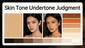
Step 1: Determine Your Skin Undertone
- Vein Test
In natural light, look at the veins on the inside of your wrist:
- Blue or purple veins → Cool undertone
- Green or olive veins → Warm undertone
- A mix of blue and green, hard to distinguish → Neutral undertone
- Gold vs. Silver Jewelry Test
Try on gold and silver jewelry separately and compare the effects:
- Gold jewelry enhances your glow and makes your skin look brighter → Warm undertone
- Silver jewelry makes you look more radiant and sophisticated → Cool undertone
- Both look equally good → Neutral undertone
- White Fabric Comparison Test
Hold a piece of pure white fabric and a piece of off-white fabric against your face respectively:
- Off-white makes your skin look brighter → Warm undertone
- Pure white makes you look more energetic → Cool undertone
- Little difference between the two → Neutral undertone

Step 2: Choose Colors Based on Your Skin Undertone
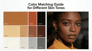
1. Warm Undertones (Ideal for Warm & Low-Saturation Hues)
- Recommended Colors:
Off-white, cream yellow, warm orange, caramel, brick red, olive green, camel, warm brown, etc. These hues blend seamlessly with warm skin, brightening your complexion and exuding vitality.
- Colors to Avoid:
Cool-toned true blue, icy purple, fluorescent pink, stark white. These shades can make warm skin look dull, sallow, or tired.
2. Cool Undertones (Perfect for Cool & High-Saturation Hues)
- Recommended Colors:
Stark white, true blue, mint green, icy purple, fuchsia, burgundy, gray, silver, etc. These colors highlight the natural clarity of cool skin, creating a sleek or graceful look.
- Colors to Avoid:
Earthy yellow, orange yellow, caramel, dark orange. These hues can make cool skin appear sallow and lose its translucent glow.
3. Neutral Undertones (Versatile for All Colors)
- Pro Tip:
Experiment with mixing warm and cool tones (e.g., cool blue with warm camel) for a layered look. You can also adjust colors based on your makeup—opt for soft hues with light makeup and bold, high-saturation colors with heavy makeup.

Step 3: Optimize Color Choices by Scenario & Needs
- By Occasion
- Office & Business Commute: Prioritize low-saturation neutrals (black, white, gray, camel, navy) for a professional and polished look. Add small pops of bright colors with accessories for a touch of personality.
- Daily Casual Wear: Feel free to try warm tones or pastel shades for a relaxed, lively vibe.
- Formal Events (Gala, Business Dinner): Choose high-quality dark colors (black, burgundy, forest green) or metallic shades to exude sophistication.
- By Silhouette Needs
- For Slimming Effects: Stick to dark hues (black, navy, charcoal gray) which visually shrink the silhouette. Avoid large areas of bright colors or horizontal stripes.
- For Adding Fullness: Opt for light or warm tones (off-white, pale yellow, pink) which create a subtle voluminous effect. Stay away from overly dark shades.

Final Tips to Elevate Color Coordination
- Stick to 3 Colors Max per Outfit: Let the main color account for 60%, the secondary color 30%, and the accent color 10% to avoid a cluttered look.
- Use Neutral Base Colors as Transitions: Black, white, gray, and camel are “universal transition colors” that can balance conflicting hues.
- Take Inspiration from Nature: Earth-tone combinations, blue-and-white pairings, and pink-and-green matches are timeless, fail-safeoptions. https://chinese.alibaba.com/product-detail/2025-Fashion-Trend-New-Men-s-1601617860741.html
How useful was this post?
Click on a star to rate it!
Average rating 0 / 5. Vote count: 0
No votes so far! Be the first to rate this post.


-35-2-768x432.png)