Welcome To Our Official Website, And We Will Provide You With Excellent Service.

How to Choose Clothing Colors That Suit You
Choosing the right clothing colors can not only brighten your complexion and create a more flattering silhouette but also highlight your personal temperament. The core principle is to match your skin undertone + align with scenario needs. Here is a practical, step-by-step guide:
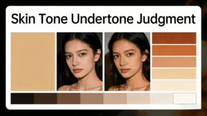
Step 1: Determine Your Skin Undertone
Skin undertones are classified into warm, cool, and neutral (a balanced mix of both). You can easily figure out yours with these three simple tests:
- Vein Test
In natural light, look at the veins on the inside of your wrist:
- Blue or purple veins → Cool undertone
- Green or olive veins → Warm undertone
- A mix of blue and green, hard to distinguish → Neutral undertone
- Gold vs. Silver Jewelry Test
Try on gold and silver jewelry separately and compare the effects:
- Gold jewelry enhances your glow and makes your skin look brighter → Warm undertone
- Silver jewelry makes you look more radiant and sophisticated → Cool undertone
- Both look equally good → Neutral undertone
- White Fabric Comparison Test
Hold a piece of pure white fabric and a piece of off-white fabric against your face respectively:
- Off-white makes your skin look brighter → Warm undertone
- Pure white makes you look more energetic → Cool undertone
- Little difference between the two → Neutral undertone


Step 2: Choose Colors Based on Your Skin Undertone
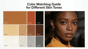
1. Warm Undertones (Ideal for Warm & Low-Saturation Hues)
Warm skin has yellow or golden undertones. Opt for colors that complement this warmth and avoid harsh cool-toned fluorescent shades.
- Recommended Colors:
Off-white, cream yellow, warm orange, caramel, brick red, olive green, camel, warm brown, etc. These hues blend seamlessly with warm skin, brightening your complexion and exuding vitality.
- Colors to Avoid:
Cool-toned true blue, icy purple, fluorescent pink, stark white. These shades can make warm skin look dull, sallow, or tired.
2. Cool Undertones (Perfect for Cool & High-Saturation Hues)
Cool skin has pink or blue undertones. Go for colors that accentuate a crisp, elegant vibe and steer clear of overly heavy warm tones.
- Recommended Colors:
Stark white, true blue, mint green, icy purple, fuchsia, burgundy, gray, silver, etc. These colors highlight the natural clarity of cool skin, creating a sleek or graceful look.
- Colors to Avoid:
Earthy yellow, orange yellow, caramel, dark orange. These hues can make cool skin appear sallow and lose its translucent glow.
3. Neutral Undertones (Versatile for All Colors)
Neutral skin works with almost all color families. You can freely choose shades based on your style and occasion.
- Pro Tip:
Experiment with mixing warm and cool tones (e.g., cool blue with warm camel) for a layered look. You can also adjust colors based on your makeup—opt for soft hues with light makeup and bold, high-saturation colors with heavy makeup.
Step 3: Optimize Color Choices by Scenario & Needs
- By Occasion
- Office & Business Commute: Prioritize low-saturation neutrals (black, white, gray, camel, navy) for a professional and polished look. Add small pops of bright colors with accessories for a touch of personality.
- Daily Casual Wear: Feel free to try warm tones or pastel shades for a relaxed, lively vibe.
- Formal Events (Gala, Business Dinner): Choose high-quality dark colors (black, burgundy, forest green) or metallic shades to exude sophistication.
- By Silhouette Needs
- For Slimming Effects: Stick to dark hues (black, navy, charcoal gray) which visually shrink the silhouette. Avoid large areas of bright colors or horizontal stripes.
- For Adding Fullness: Opt for light or warm tones (off-white, pale yellow, pink) which create a subtle voluminous effect. Stay away from overly dark shades.
Final Tips to Elevate Color Coordination
- Stick to 3 Colors Max per Outfit: Let the main color account for 60%, the secondary color 30%, and the accent color 10% to avoid a cluttered look.
- Use Neutral Base Colors as Transitions: Black, white, gray, and camel are “universal transition colors” that can balance conflicting hues.
- Take Inspiration from Nature: Earth-tone combinations, blue-and-white pairings, and pink-and-green matches are timeless, fail-safeoptions. https://chinese.alibaba.com/product-detail/2025-Fashion-Trend-New-Men-s-1601617860741.html
How useful was this post?
Click on a star to rate it!
Average rating 0 / 5. Vote count: 0
No votes so far! Be the first to rate this post.


-35-2-768x432.png)